Brief
For my project, I was assigned the responsibility of revitalizing the image of my hometown. The objective was to develop a fresh logo, a catchy tagline, and several deliverables.
Challenge
A significant hurdle faced during this project involved crafting a logo that harmonized with the distinct essence of Altoona's environment.
Goal
The main goal of this project was to establish a brand that would appeal to both families and individuals alike. Striking a balance between a logo that is not overly child-oriented yet not excessively mature was a key objective.
Unique Solution
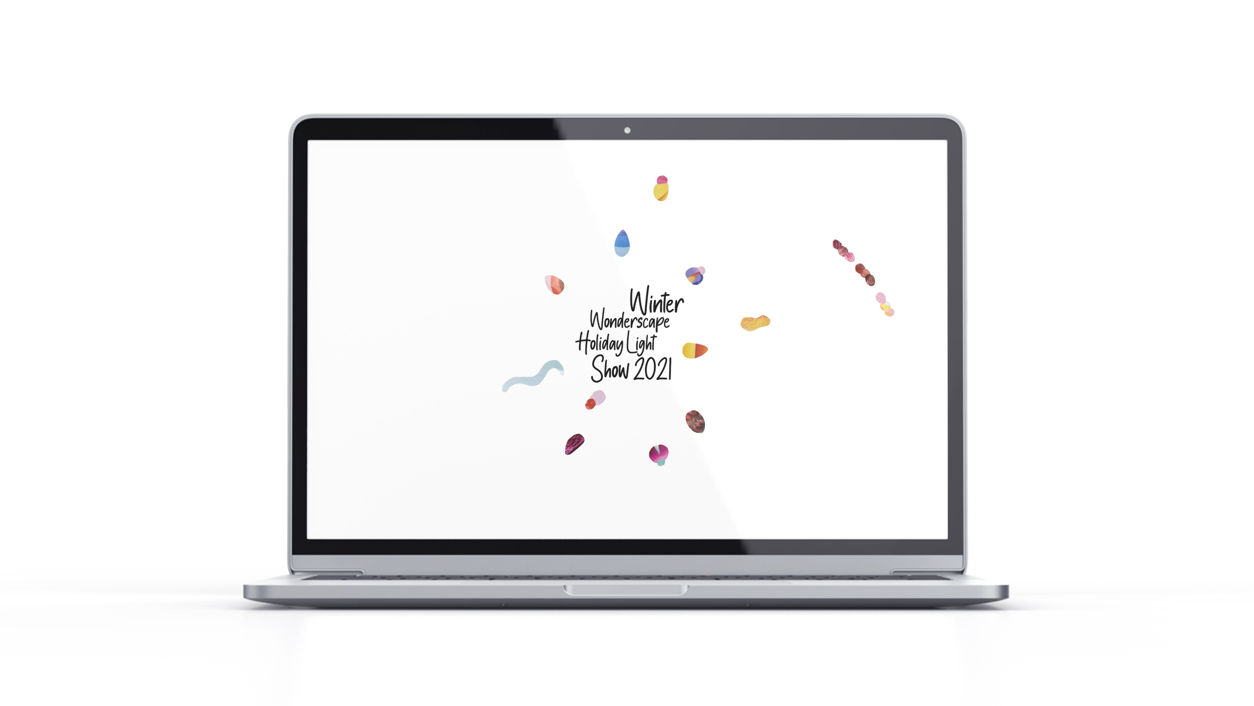
In my final logo design, I aimed to achieve a mature yet playful aesthetic by combining sophisticated shapes with vibrant colors. The central concept was to depict Altoona as a circle, symbolizing unity and community. To highlight the diversity of individuals within Altoona, I divided the circle into distinct pieces, showcasing the wide range of people who call the city home.
Original Logo
Rebrand Logo
Mockup

