Brief
In this particular project, I was tasked with creating a magazine dedicated to typography. While exploring various typographical styles, I became particularly drawn to warning signs and their distinctive typography. These ubiquitous signs are a constant presence in our surroundings, yet we often fail to take notice of them.
Challenge
The primary challenge involved locating warning signs in my community and capturing them in a compelling manner. Once I had acquired sufficient visual content, the next obstacle was determining the most effective means of showcasing this material within a magazine format.
Goal
My objective was to maintain a cohesive and consistent theme throughout the magazine that aligned with my overarching "warning signs around us" concept.
Unique Solution
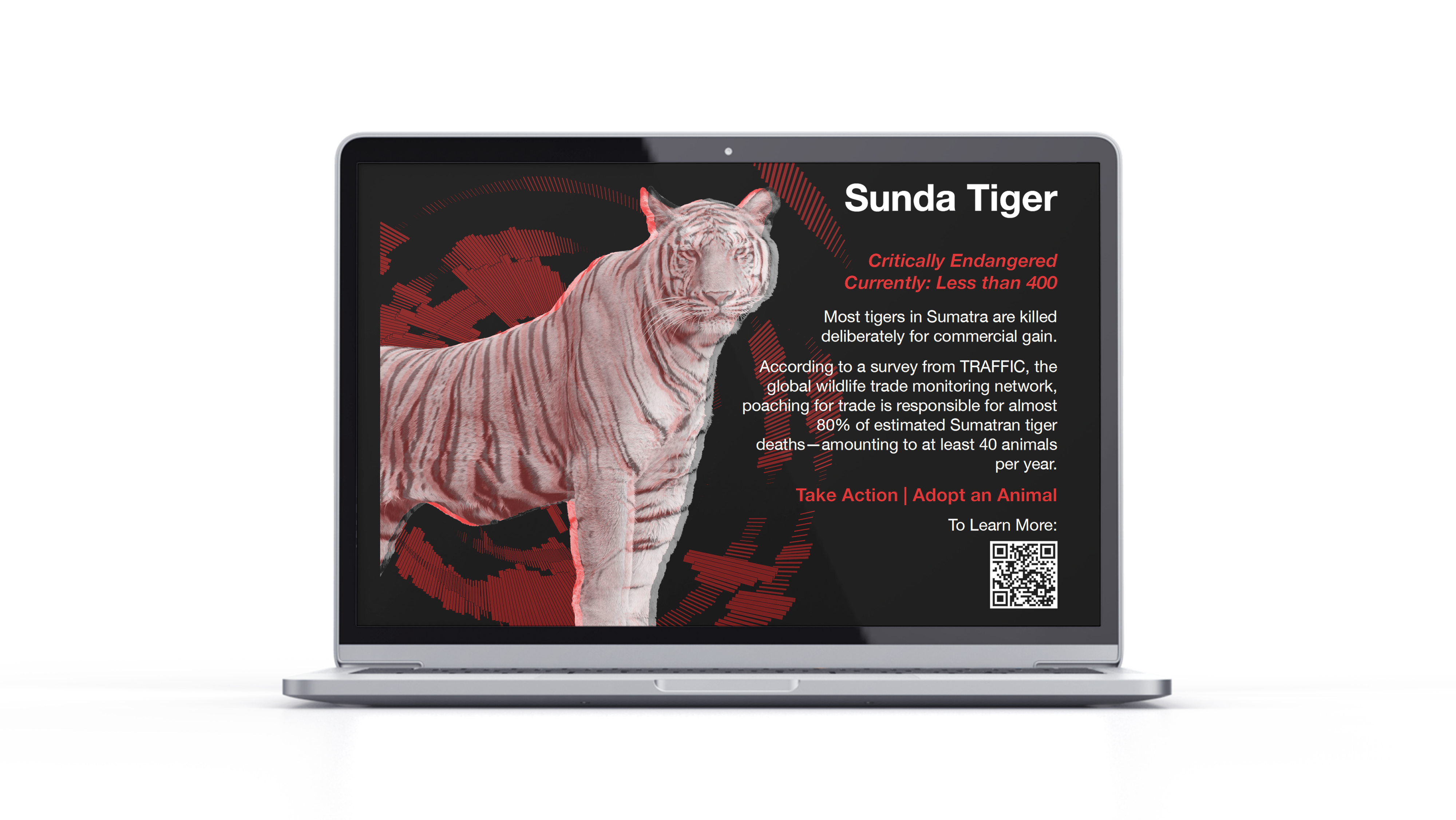
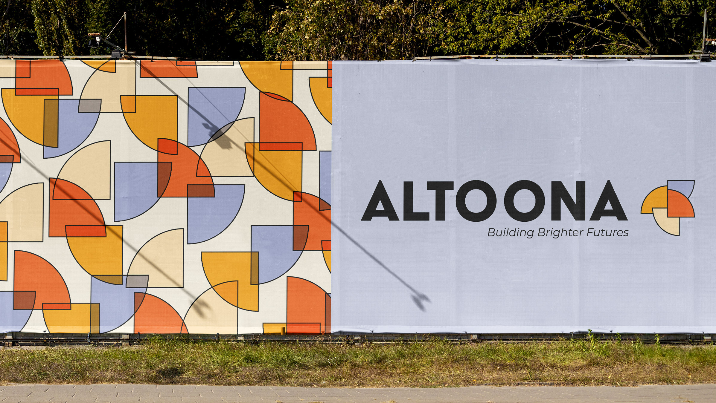
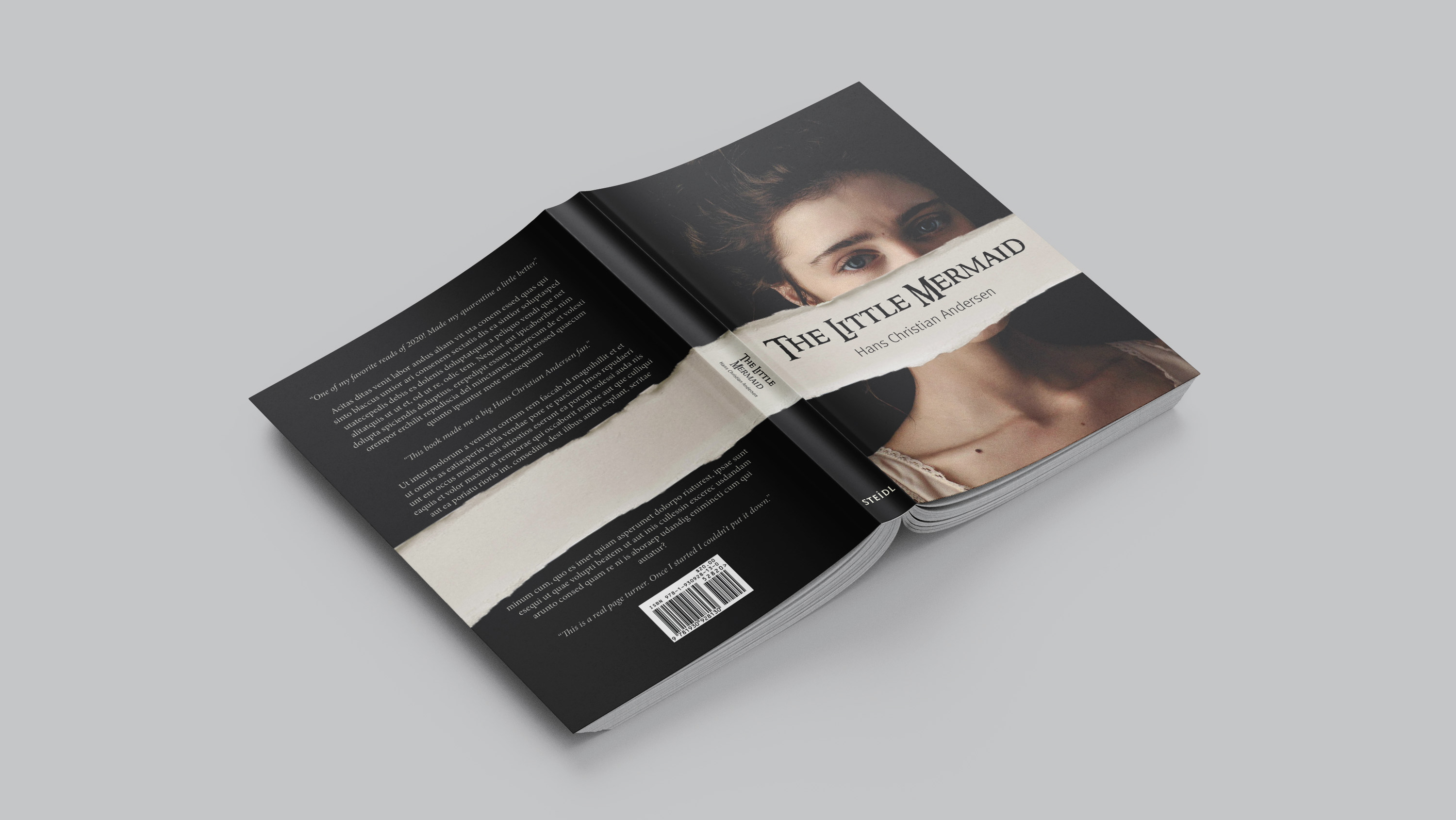
To achieve this objective, I incorporated a spot color of red throughout the magazine's spreads, creating a visual thread that tied the entire publication together. Additionally, I employed typography in a playful and creative manner on specific pages, aligning with the overall "warning signs around us" theme and adding a touch of whimsy to the design.

Mockup Slideshow
(Please click the image and then use arrow keys)